Election Design System
A design system for live election results at The Irish Times — built to be readable at a glance on any device, and reusable across elections that count votes in completely different ways.
Elections are the bread and butter of a national newspaper, and for 2016 the goal was to be the fastest source of results in the country. Engineering built a bespoke system that let journalists file results in real time as they were counted, straight into a database and out to the coverage site through an API.
I led the design of what readers actually saw.
What I did
The brief was a system, not a page. It had to work across every device, and it had to be reusable — the Irish general election, the UK, Northern Ireland, the US — while staying manageable enough that we weren’t rebuilding it each time.
That’s harder than it sounds, because elections don’t agree with each other. The number of candidates in a constituency varies enormously between electoral systems, so any layout that assumed a candidate count would break the first time it met a different one. The core problem was holding two views at once: the state of the whole election at a glance, and a way down into a single constituency.
The constituency card is where that got resolved. It carries the name, one block per seat coloured by the winning party, and a plain-language count of how far the count has got. Read as a grid, the cards are the whole election at a glance; tapped, each one is the way in.
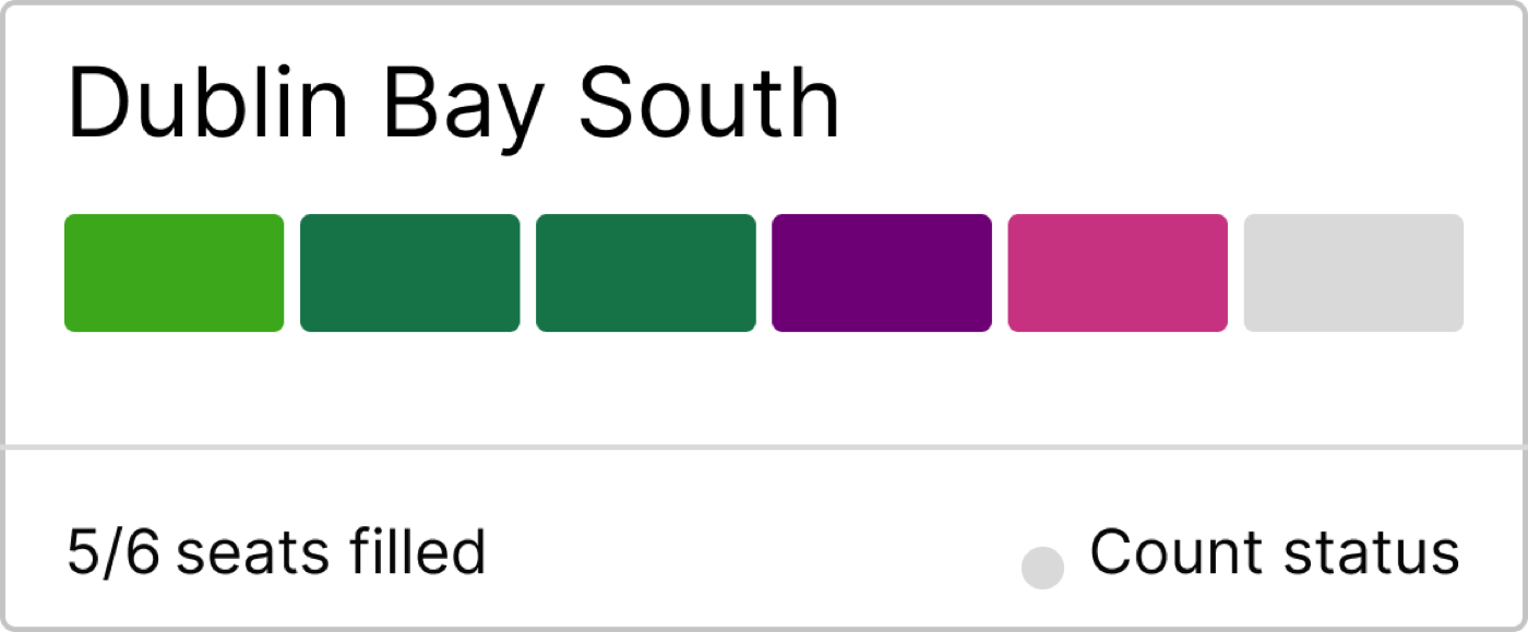
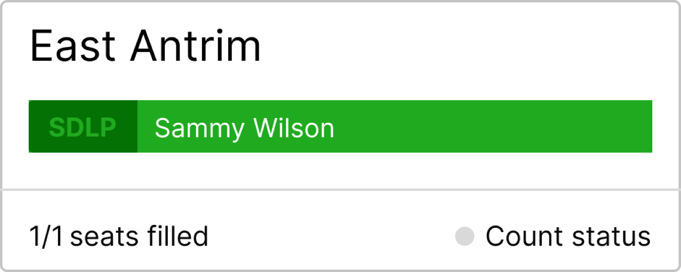
The harder half of the card wasn’t the finished result — it was every state before it. A constituency spends most of election night part-counted, and the card had to be readable at each stage without ever implying a seat was settled when it wasn’t. Counting starts, seats fill one at a time, the count pauses overnight, and eventually it completes.
Here’s the card with those states switchable, rebuilt so you can move through them:
Prototype states
Pick a state. Hover a coloured seat to see who holds it, or click the card to expand.
Dublin Bay South
Two things that only show up when you handle it. The status dot doesn’t rely on colour alone — paused reads as a hollow ring, counting pulses — because a colour-only status is exactly the thing that fails at a glance on a phone in bad light. And the filled seats are real buttons, so the candidate behind each one is reachable by keyboard and announced to a screen reader, not just revealed on hover.
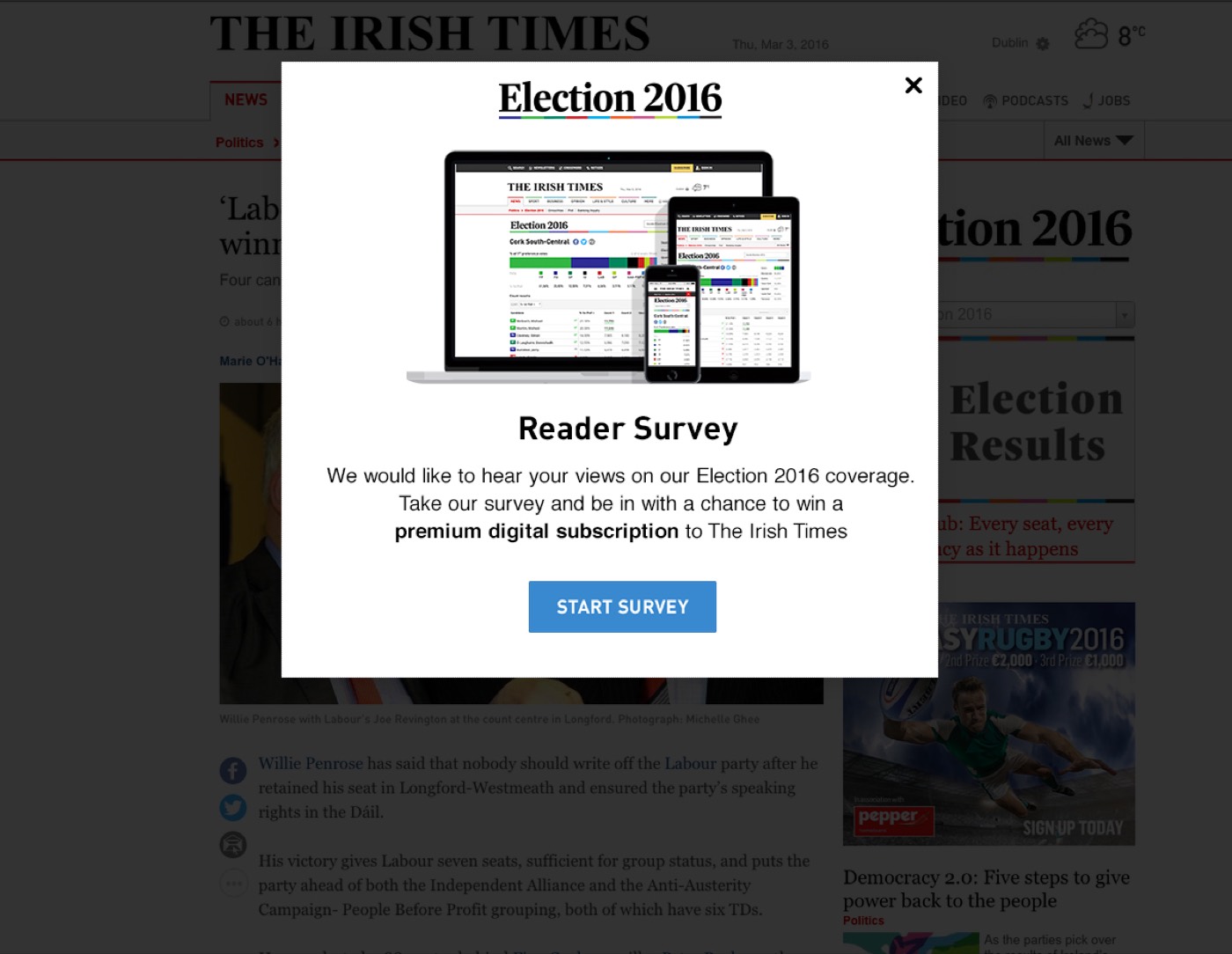
After the election I surveyed readers on how the results coverage had worked, so the next one could start from evidence rather than from scratch.
What I took from it
You are designing for data that doesn’t exist yet, and dummy data lies to you. Double-barrelled surnames and whitewash results were the two that caught me — both obvious in hindsight, neither present in the placeholder content, both forcing changes by the time the second election came around.
The other lesson was to front-load the domain. Getting the experts to teach the team how the voting system actually works, before anyone designed anything, would have saved hours of meetings and QA later.
And I’d assumed an election project would be dry. Tight deadlines, real stakes and a hard deadline nobody can move turned out to be the most rewarding constraints I’d worked under.