In-app Messaging
Swrve's in-app messaging was powerful and barely usable — a feature nobody had touched in five years, losing enterprise deals to competitors. I ran the research and the usability programme that rebuilt it.
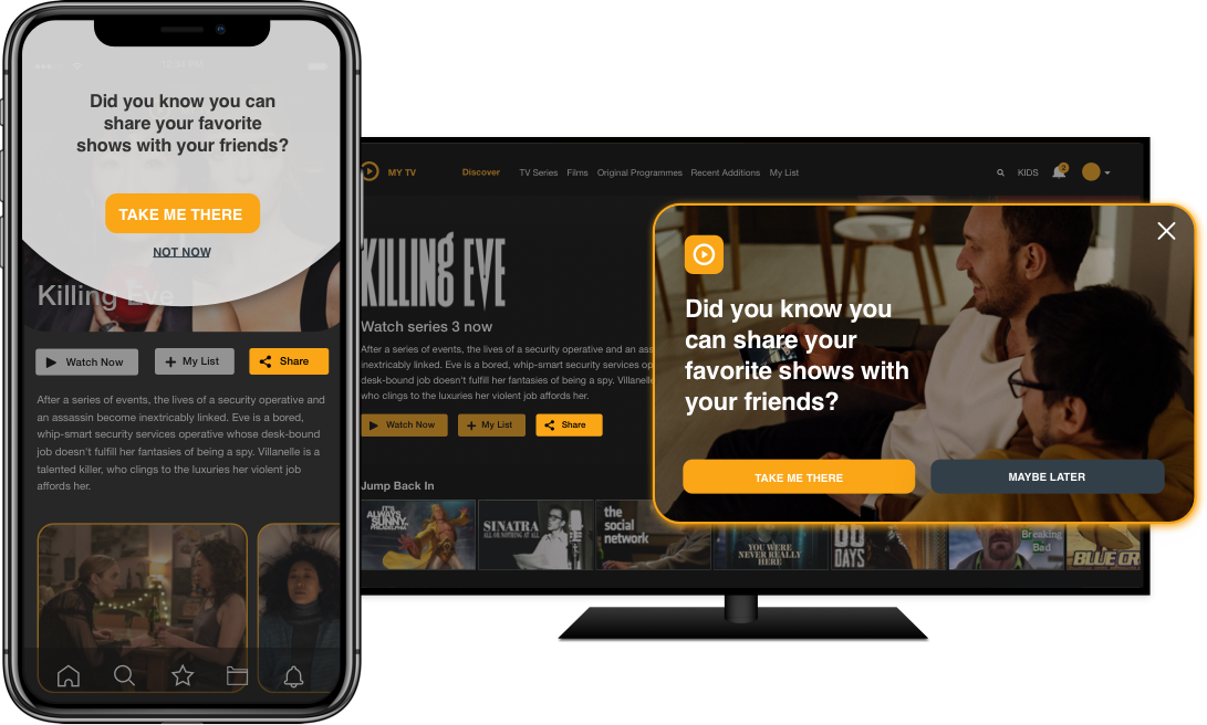
Swrve’s job was to let enterprise marketers reach their customers through mobile experiences that felt relevant rather than broadcast. In-app messaging was the part of that closest to the marketing executive — our primary user — and it was in the worst state.
The system underneath was genuinely powerful. The experience on top of it was not. It slowed people down, it was measurably less desirable than what competitors offered, and it was missing table-stakes functionality like personalisation. That last gap was costing us new business in the enterprise market.
There was a second goal running underneath the first: the workflow should match the one we’d already built for push campaigns, so that a marketer moving between the two didn’t have to learn a second interface to do the same job.
The framing question I took into the work:
How can we enable our customers to send more personalised messaging to their users that is on brand and easier to create, within the limits of our existing tech?
Scope and constraints
The feature hadn’t been worked on in over five years, and I knew very little about how it actually worked inside. There were far more requests and use cases than one project could absorb, and they came from customers across every vertical we served — so the research had to stay broad before it went deep. I also knew this research would be relevant to several later projects, which was another argument for a general understanding first.
Three constraints shaped what was possible:
- Our SDKs were image-based, while customers expected an in-app experience closer to email — that is, HTML.
- The engineering team halved partway through the project.
- I was assigned to two other projects over the same period.
Team: two product designers, a product manager and a content writer. My part: user research, usability testing and user flows. Twelve weeks of discovery, six weeks of usability testing, starting Q1 2020.
What I did
Because I was starting from near-zero domain knowledge, I went wide before going deep:
- Five customer interviews, covering twenty stakeholders in total
- Cognitive walkthroughs of the existing workflow
- Dashboard analysis of real example campaigns
- Competitor analysis
- Database analysis of how the feature was actually used
- Salesforce and Zendesk analysis to find the right customers to talk to
Four findings did most of the work.
Email is the benchmark, not other mobile tools. Enterprise customers come from an email world where the tooling is far more mature. They expected in-app messaging to give them the same depth of personalisation, and judged it against that.
The workflow was expensive in time. Running one campaign with several in-app messages meant producing assets in Photoshop — or waiting on a designer — and then uploading images for every single campaign.
On-brand meant basic formatting. Italic, bold, font size, colour, typography. Not exotic; just absent.
Nothing was reusable. Users re-uploaded the same image every time, even when it hadn’t changed. There was no way to save content for later or copy it into another variant when running an A/B test.
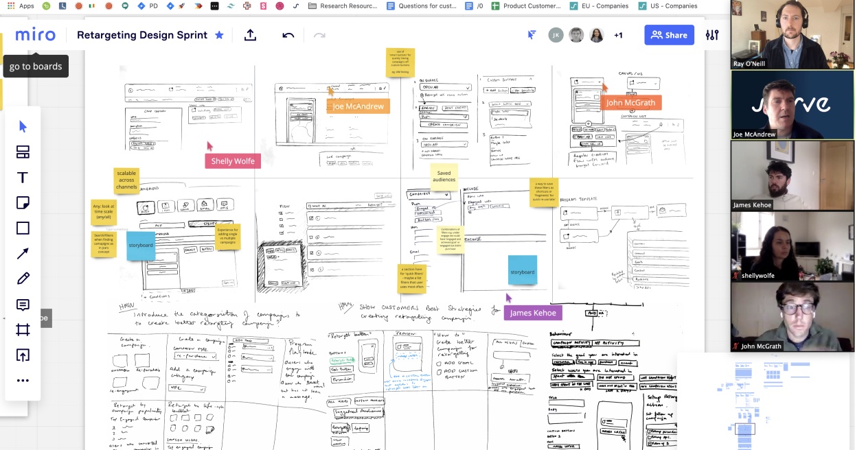
Then a design sprint, three development sprints before build was due to start. It was my first remote sprint — this was Q2 2020, and we were all still working out how to work from home. Facilitating in Miro rather than a room meant I cut the format down to two full days plus two half days with a smaller group and some activities done offline.
Testing early, and often
Our team’s habit was to leave usability testing until just before release. I pushed hard against that here, because this feature sat in the middle of our customers’ actual jobs — getting it wrong would damage their workflow and their business results, not just our metrics.
So I ran at the development team’s cadence, in two-week sprints. Findings went into Show & Tell; usability problems and proposed changes went into sprint planning. Testing ran over six months in total.
The study was within-subjects, pairing usability tasks with open-question interviews, and split across two modes:
- Five moderated sessions with internal users from the Customer Success team
- Fifteen unmoderated sessions with real users already familiar with the Swrve dashboard, testing InVision prototypes through Maze
In later stages I moved testing onto the early-access build running on the staging dashboard, so people were handling the real thing.
I broke the tests along the core workflows — creating a message, defining the audience, scheduling and delivery, and adding content to the campaign. Creation, goal setting and audience definition shared their workflow with the push campaigns project we’d tested and shipped the year before, so I put the emphasis on the sections that were genuinely new.
What the testing found
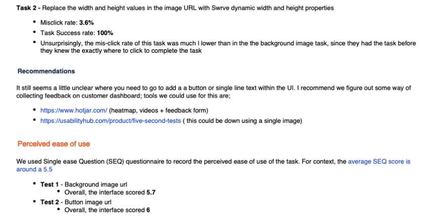
Every user completed every task — task success was 100% — and perceived ease of use was good. I measured that with the Single Ease Question after each task, against a published average of about 5.5: the background image URL task scored 5.7, the button image URL task 6.
Those numbers alone would have closed the study. The heatmaps are what stopped it.
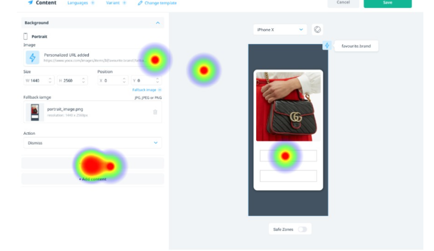
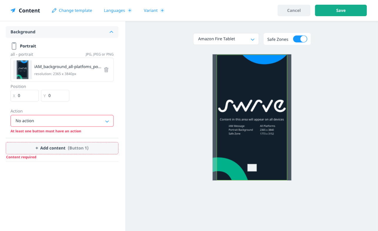
The sharpest problem was adding a button to a message. Users’ mental model was that they could click the preview to do it. In the design, you had to go to Add content. That looked like a findability issue until I dug into it: three of five participants understood “add content” to mean optionally adding new buttons and text components to the template — when in fact those buttons were already set in the template and were required to complete the form.
That reframed it from a labelling nuisance into a comprehension failure, and it changed two things in the product. We rewrote the labelling, and engineering built form validation that told people what was missing when they tried to save.
What I took from it
This was the largest usability study I’d run at Swrve. Twenty participants was a real feat given how early the organisation was in its UX maturity, and getting there mattered as much as the findings.
I’d design the study differently. It was within-subjects, and testing similar prototypes with the same people caused confusion — several participants struggled to recall what differed between the versions they’d seen. Between-subjects would have given me cleaner signal.
Unmoderated testing bought access I couldn’t otherwise get. Maze let me reach marketing executives who would never have agreed to a scheduled call. That produced usability issues we’d missed testing internally, and a lot of incidental knowledge about how these people and their teams actually work.
The real prize was cultural. Testing continuously, in the open, at the development team’s rhythm, meant stakeholders became invested in it — proposing areas to test, actively finding participants. That freed me to concentrate on study design and analysis rather than recruitment, and it outlasted the project.